These branding case studies explore selected identity projects in detail — from the initial brief through to the finished system. Each one outlines the thinking, the decisions, and the craft that goes into building a brand that works harder than a logo.
Client:
Ginger Square
Service:
Artisan bakery and food producer based in the North of England, specialising in handmade baked goods, preserves and gifting products.
Brief:
Ginger Square needed a brand that could hold its own on a shelf, on a tote bag, and on a social feed — all at the same time. A bakery with real personality needed an identity that matched it. Warm, characterful, and built to travel.
The Approach:
Food brands live and die by feel. The identity needed to communicate the kind of modern place Ginger Square is before anyone reads a word — somewhere handmade, considered, and worth going out of your way for. The mark, the pattern, the colour palette, the typography — all of it had to feel like it belonged together, like it had always existed.
The Work:
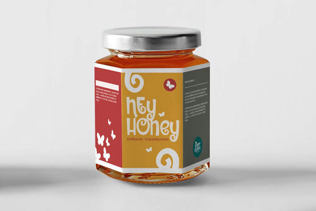
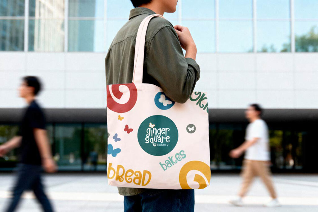
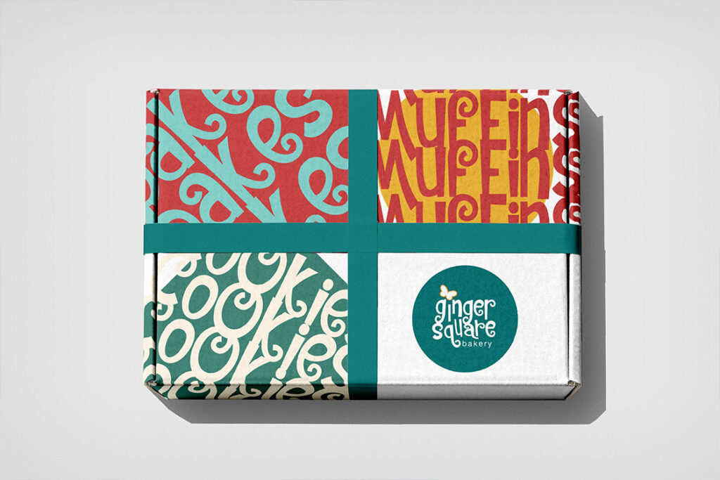
A distinctive circular mark built around the Ginger Square name. A hand-feel pattern system that works across every surface. A palette based around teal – warm enough to make you hungry. Packaging across product lines including the Hey Honey jar. Branded wrapping paper and tote bags. A full identity system ready to scale.
Client:
SMC Building Services
Service:
Commercial building services company specialising in construction, facilities management and sustainable building solutions.
Brief:
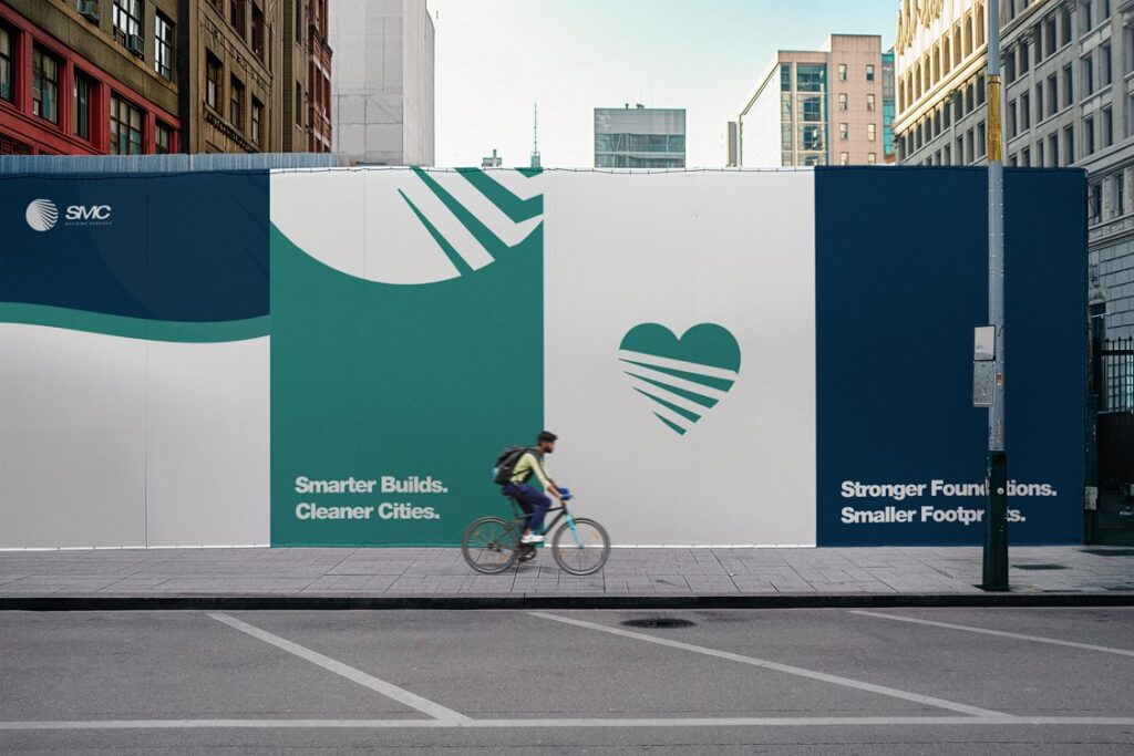
SMC Building Services needed a brand that could work at scale — on hoardings, hard hats, and headed paper — while communicating the values at the core of the business. Smarter builds. Cleaner cities. Stronger foundations. The identity needed to say all of that without saying a word.
The Approach:
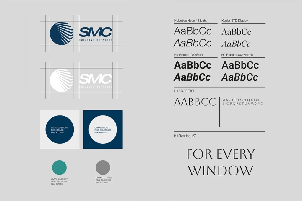
Building services is a crowded sector where most brands look identical — safe and forgettable. The brief was to stand out without losing credibility. The solution was a mark built around motion and precision — a globe-form icon with a distinctive striped building structure that references both built environment and forward momentum. Paired with a considered typographic system and a palette that balances authority with approachability.
The Work:
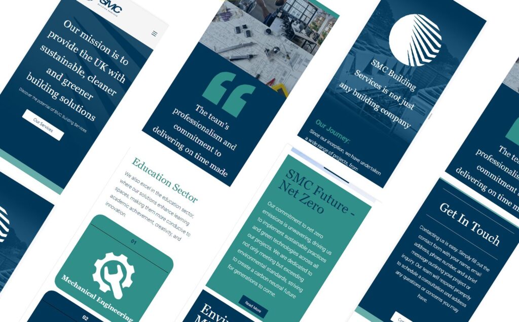
Logo and brand mark development. Full typography system across display, heading and body weights. Colour palette. Business stationery and print applications. Large format hoarding design. Brand guidelines covering all applications from digital to construction site signage.
Client:
Owen Lazenby Auto Detailing
Service:
Premium auto detailing service specialising in high-end vehicle care, paint correction and protective coatings.
Brief:
Owen Lazenby Auto Detailing needed a brand that reflected the quality of the work — precise, premium, and built for a discerning clientele. The identity had to work on a cap, a business card, and a vehicle wrap without losing its edge.
The Approach:
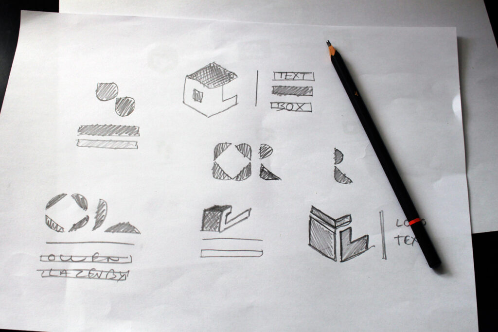
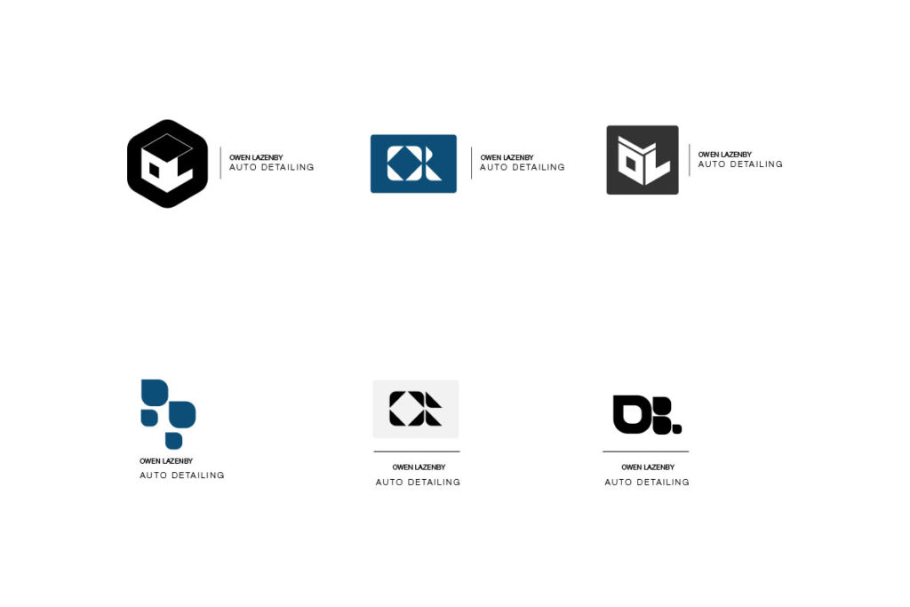
Auto detailing sits at the intersection of craft and obsession. The brand needed to communicate both — the technical precision of the service and the pride that goes into every finish. A monogram-led mark was the right direction, building the OL initials into a geometric form that feels considered and distinctive. Six directions were explored before arriving at the right solution — clean geometry, strong negative space, no fuss.
The Work:
Logo mark development across six concept directions. Final mark refinement and lockup system. Typography selection and pairing. Application across branded merchandise including cap and stationery. Brand ready for rollout across vehicle signage, social and print.
Every project starts with a problem worth solving. If you’ve got one, let’s talk.