Scrolling is the most natural thing a person does on the web. They’ve been doing it since the mid-nineties. And for most of that time, designers treated it as a neutral act — a way of moving from one block of content to the next, nothing more.
Scroll-driven animation changed that. When the scroll position becomes an input rather than just a navigation mechanism, reading stops being passive. The reader is no longer moving through content. They are controlling it.
That shift has consequences — for how copy is written, how pages are structured, and how meaning is made. This post is about those consequences.
The Difference Between Triggered and Driven
There are two types of scroll animation and they are not the same thing.
Triggered animation fires when an element enters the viewport. The user scrolls down, a threshold is crossed, an animation plays. The user has no control over the animation itself — they just unlock it by arriving.
Scroll-driven animation ties the animation directly to scroll position. The further the user scrolls, the further the animation progresses. Scroll back up and the animation reverses. The user is not unlocking something — they are operating it.
Most websites use triggered animation. It is easier to implement, more predictable, and works well for simple reveals. But it treats the scroll as an event rather than a continuum. The user arrives, the thing plays, they move on.
Scroll-driven animation treats the scroll as a timeline. The user is not an audience — they are an editor, moving through a sequence at their own pace.
What Scroll-Driven Animation Does to Reading
Reading on screen is already different from reading on paper. People scan rather than read linearly. They look for anchors — headings, bold text, images — and skip between them. Eye-tracking studies have shown this consistently for decades.
Scroll-driven animation disrupts that pattern in an interesting way.
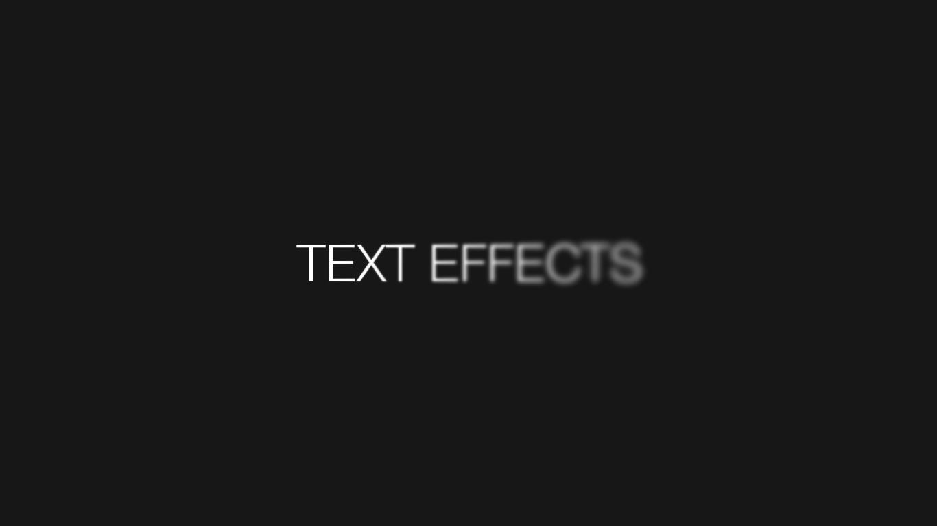
When text reveals itself in response to scroll — character by character, line by line, word by word — the reader cannot scan ahead. The content is not there yet. To see what comes next, they have to keep scrolling. The animation forces a linear reading experience on a medium that is inherently non-linear.
This is either a feature or a bug depending on what you are trying to say.
If your copy is strong — if each line earns the next — scroll-driven reveal turns reading into a performance. The pacing is controlled. The emphasis is built in. The reader experiences the text the way the writer intended, in the order the writer intended.
If your copy is weak, scroll-driven animation makes the weakness impossible to ignore. There is nowhere to hide when each word arrives individually and demands attention before the next one appears.
Pacing and the Scroll as Punctuation
In print, punctuation controls pace. A full stop is a pause. A comma is a breath. A new paragraph is a beat of silence.
On a scroll-driven page, the scroll is punctuation.
The distance between reveals — how far the user has to scroll before the next line appears — is the equivalent of white space on a printed page. A long scroll between two lines creates anticipation. A short one creates momentum.
This means the design decisions and the copy decisions are inseparable. You cannot write the text and then decide how to animate it as an afterthought. The animation is part of the writing. The scroll distance is part of the sentence.
At The Northern Bureau we found ourselves rewriting copy specifically because of the animation — shortening lines so they held as single units, choosing words that worked in isolation before the surrounding context arrived. The constraint made the writing better.
The Risk of Spectacle Over Substance
There is an obvious danger in all of this: the animation becomes the point.
It is easy to build a scroll-driven text reveal and spend the rest of the day watching it. The blur effect, the scramble decode, the glitch — they are satisfying to watch in a way that has nothing to do with what the words are saying. The medium starts to overpower the message.
The test is simple: if you read the copy without the animation, does it still land? If the answer is no, the animation is doing load-bearing work that copy should be doing. That is a problem.
Animation should amplify meaning, not manufacture it. A strong line revealed through a blur effect hits harder because the animation gives it space and ceremony. A weak line revealed through the same effect just arrives slowly.
Scroll-Driven Animation and Attention Spans
There is a common assumption that attention spans online are getting shorter and that this should inform design decisions. Build for skimmers. Put the key message above the fold. Never make someone scroll to find out what you do.
Scroll-driven animation pushes back against this assumption — not by ignoring it, but by earning the scroll.
When the page is doing something interesting in response to the user’s input, the user keeps scrolling. Not because they have to, but because the interaction itself is engaging. The scroll is not a tax on the reader’s patience — it is the experience.
This changes the calculus around page length and content density. A static page with ten sections needs to justify every section in terms of information value. A scroll-driven page can use those sections to build a mood, establish a rhythm, and create a sense of arrival when key content finally lands.
The question is not how much content is on the page. The question is whether the page rewards the scroll.
What This Means for Copy
Writing for a scroll-driven page is different from writing for a standard web page. A few principles worth following:
Write in short units. Each line that appears on its own needs to work on its own. If the meaning only becomes clear once three lines have appeared, the reader will be confused or bored by the time they get there.
Front-load the interesting word. In a line-by-line reveal, the first word appears first and waits longest. Make it earn that position. A line that starts with a weak word — “The”, “A”, “This” — wastes the moment of arrival.
Use repetition deliberately. Scroll-driven animation makes repeated structures feel rhythmic rather than repetitive. Three lines with parallel construction — same opening word, escalating content — land like a drumbeat. Vary the structure too much and the animation loses its effect.
Cut harder than you think you need to. Every word that doesn’t need to be there is a word the reader has to scroll past. On a standard page this is mildly inefficient. On a scroll-driven page it breaks the rhythm and tests patience.
The Wider Shift
Scroll-driven animation is part of a broader shift in how the web thinks about time. Static pages exist in space — the user moves through them by navigating up and down. Scroll-driven pages exist in time — the user moves through them by operating a timeline.
This makes the web closer to film than to print. The designer is not arranging elements on a page. They are directing a sequence.
That is a significant responsibility and a significant opportunity. The tools are available — CSS scroll timelines, IntersectionObserver, vanilla JavaScript scroll listeners — and they are lighter and more performant than they have ever been.
The constraint is not technical. It is editorial. The question is not whether you can make the text do something interesting on scroll. The question is whether you have something interesting enough to say that it deserves that kind of attention.
If you do, scroll-driven animation is one of the most powerful tools available for making sure it lands.