Text animation is one of those design decisions that looks simple from the outside and gets complicated fast. Pick the wrong one and your site feels like a template. Pick the right one and the animation becomes part of the brand — something people notice without being able to say exactly why.
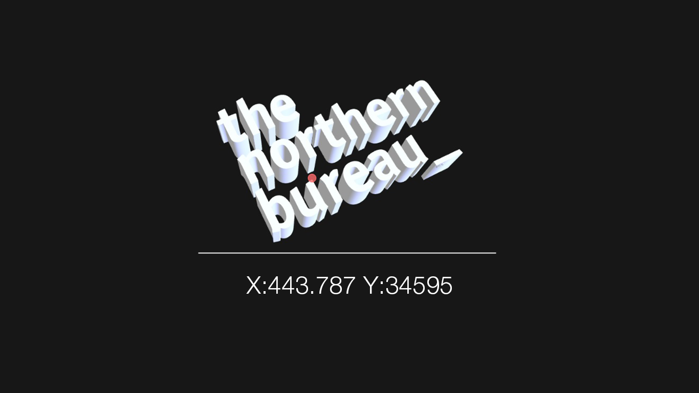
This post breaks down the most common scroll-driven text effects, what they communicate, and which types of brands they suit. We built all of these for The Northern Bureau, so the examples are real rather than theoretical.
Why Text Animation Matters
Before getting into the effects themselves, it’s worth being clear about what animation is actually doing. At its best, text animation controls the pace at which information lands. It makes the reader slow down, pay attention, and feel something before they’ve consciously processed the words.
At its worst, it’s decoration — movement for movement’s sake that gets in the way of the message.
The question to ask before choosing any effect is: what do I want the reader to feel when this text appears? The answer should inform everything else.
The Effects
1. Fade Up by Line
Each line of text fades in and rises slightly as it enters the viewport.
What it communicates: Calm, considered, professional. This is the safe choice — and safe isn’t always wrong. Fade up is readable, accessible, and works on every device without drama.
Best for: Corporate, consultancy, professional services, anyone whose audience is primarily on mobile. If in doubt, fade up.
Avoid if: You want to stand out. Fade up is everywhere. It works but it doesn’t distinguish.
2. Scramble Decode
Text starts as a stream of random characters — letters, numbers, symbols — and resolves into readable words as the user scrolls. Key words can be set to resolve early and stay readable while the surrounding text keeps churning.
What it communicates: Technical, raw, intelligent. There’s something satisfying about watching noise become signal. It suggests a brand that doesn’t give everything away immediately — one that rewards attention.
Best for: Design studios, tech companies, developers, creative agencies. Anyone who wants to feel like they’re doing something the viewer hasn’t seen before.
Avoid if: Your audience is older or less digitally native — the effect can feel confusing rather than intriguing if the viewer doesn’t immediately understand what’s happening.
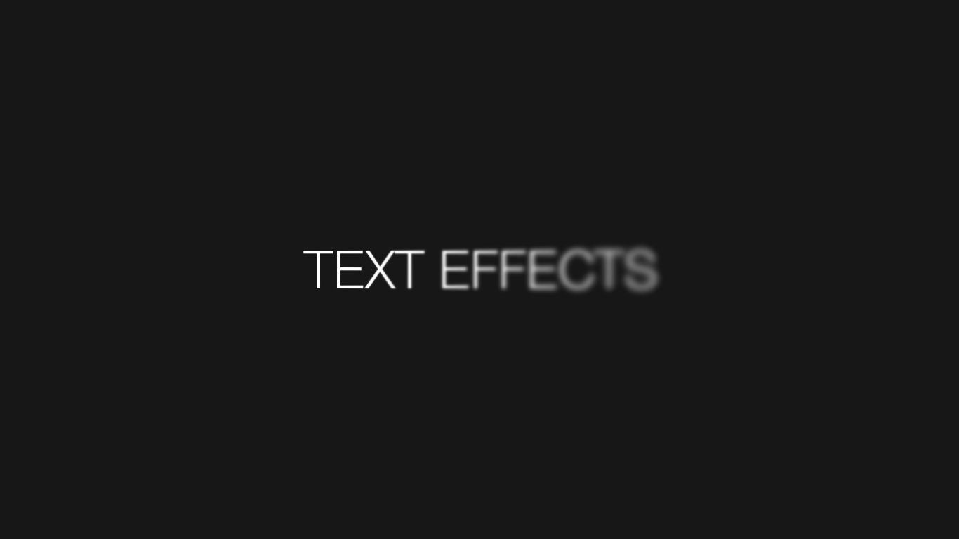
3. Blur to Sharp
Text starts blurred and snaps into focus as it enters view, either all at once or character by character on scroll.
What it communicates: Clarity emerging from noise. There’s a cinematic quality to this one — it feels expensive. The blur-in on scroll version in particular creates a sense of things coming into focus as you move through the page.
Best for: Photography, architecture, luxury brands, anyone selling precision or clarity as part of their proposition. If your brand is about seeing things clearly, this effect says it without words.
Avoid if: You have a lot of text to animate. Blur works best on short, punchy lines. Applied to paragraphs it becomes slow and frustrating.
4. Colour Wash
Text starts as a dim, low-opacity colour and a brighter colour sweeps left to right across it as the user scrolls. Words can be set to alternate between two colours for added visual interest.
What it communicates: Momentum, energy, craft. The sweep feels deliberate and controlled — like a spotlight moving across a stage. It’s flashier than blur or fade but still readable at every stage of the animation.
Best for: Creative agencies, brand studios, anyone with a strong colour identity. This effect is a chance to make your brand colours do real work rather than just sitting in a logo.
Avoid if: Your brand palette is very neutral. A white-to-white wash is invisible. This needs contrast to work.
5. Glitch Reveal
Words flicker through distorted characters and colour shifts before snapping into place. Each word lands with a brief moment of visual noise before resolving.
What it communicates: Edge, energy, irreverence. Glitch is the most aggressive of the effects — it announces itself and makes no apology for it. It’s the animation equivalent of a bold typeface.
Best for: Music, gaming, streetwear, anything targeting a younger audience or a brand that deliberately positions itself outside the mainstream.
Avoid if: You’re targeting enterprise clients, older demographics, or anyone who needs to trust you before they hire you. Glitch can read as unstable rather than edgy if the audience isn’t primed for it.
6. Letter Spacing Collapse
Text starts spread wide — letters far apart — and collapses into normal spacing as it enters view. Clean, typographic, satisfying.
What it communicates: Precision, restraint, typographic confidence. This one is for brands that care about type. It’s subtle enough that not everyone will know why it feels good, but typographically literate viewers will clock it immediately.
Best for: Publishers, editorial brands, type-led design studios, fashion. Anywhere that type is part of the visual identity rather than just a vehicle for words.
Avoid if: Your font isn’t strong enough to carry it. Letter spacing collapse only works with a typeface that looks good at extreme widths — a weak font will look broken rather than considered.
7. Clip Reveal
Text is masked behind a container and wipes into view line by line, as if being uncovered from beneath a surface.
What it communicates: Control, drama, theatre. The clip reveal has a stage quality — it feels like a curtain lifting. It’s one of the cleanest effects technically and one of the most satisfying to watch.
Best for: Luxury, fashion, film, theatre, hospitality. Anywhere the brand wants to feel like an event.
Avoid if: You have very long lines of text. Clip reveal works on short, punchy statements. It needs air around it to breathe.
8. Sequence Reveal
Lines appear one at a time — each one blurring or fading in, holding, then disappearing before the next one arrives. Driven entirely by scroll position.
What it communicates: Deliberateness. Each line gets full attention before the next one arrives. It’s the closest thing to a spoken cadence in web animation — it controls the rhythm of reading in a way no other effect does.
Best for: Brands with something to say. This effect only works if the copy is strong enough to justify individual attention. If the writing is weak, sequence reveal just makes the weakness more obvious.
Avoid if: You have more than four or five lines to show. The scroll distance required gets impractical quickly.
How to Choose
A few questions to narrow it down:
Who is your audience? The more technical or creatively literate they are, the more you can push. Enterprise clients and older demographics want legibility over spectacle.
What does your copy say? Strong, short lines suit almost any effect. Longer copy needs restraint — fade, blur, or sequence at most.
What is your brand’s personality? Map the effect to the brand character. A studio that describes itself as considered and editorial should animate like it — not glitch and scramble.
What else is on the page? Animation competes for attention. If your 3D model is already doing a lot of work, your text effects should be quieter. If the page is otherwise still, the text can carry more.
A Note on Performance
Every text effect in this post is built with vanilla JavaScript and CSS transitions — no animation libraries, no dependencies. This matters for two reasons: performance and portability. A scroll-driven animation that drops frames or causes layout shifts undermines the very effect it’s trying to create. Build light, test on real devices, and always check mobile before publishing.
The right text animation is the one that fits so naturally into the brand that the viewer doesn’t think about the animation — they just feel the effect of it. That’s the goal. Everything else is just a technical decision about how to get there.